SCHEDULE YOUR FREE CONSULTATION TODAY! Call 484-752-6571
Family Owned & Operating Since 1999
Lic#PA119000
Proudly Serving Royersford, Limerick, Pottstown, Collegeville, Phoenixville & The Surrounding Areas
FAVORITE Paint Color Trends
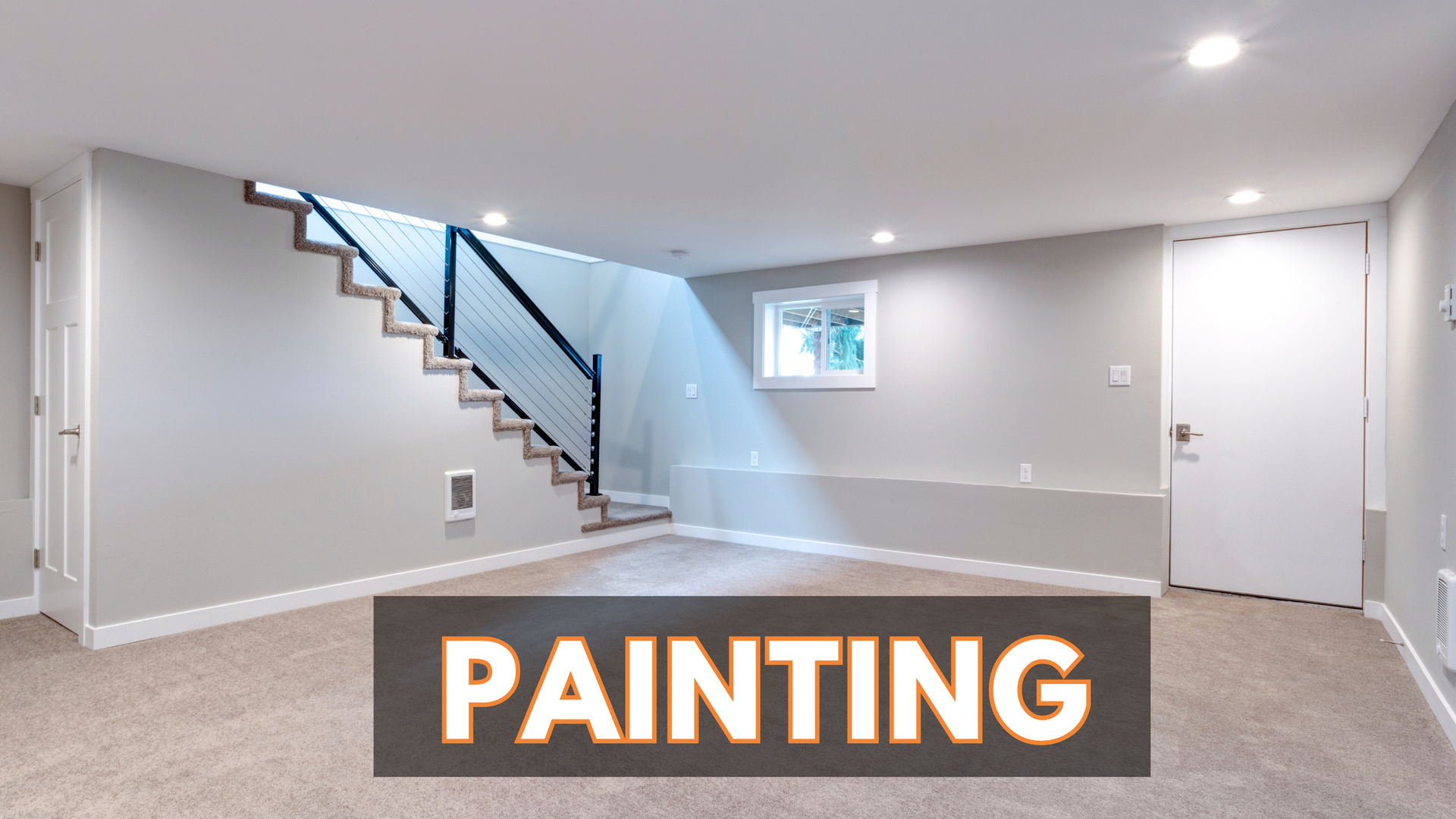
During paint estimates, we keep getting asked: what paint brand do you use and what colors are on trend?
We love Sherwin Williams for both interior and exterior paint and stains. The quality is superior and we look at four components when making that decision: pigment, binders, liquids, and additives. Sherwin Williams' recipe of all four components results in a long-lasting, easy to apply, and true-to-color paint. We will use any material you purchase yourself, but Sherwin Williams is our no. 1 recommendation and the brand we love using!
When it comes to color, of course, we want to pair you with colors that match your personal style and personality, but have no problem filling you in on top trends. Here are the top paint color trends seen by Sherwin William.
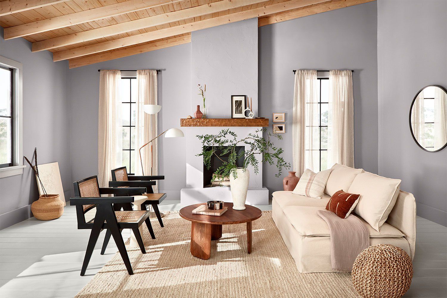
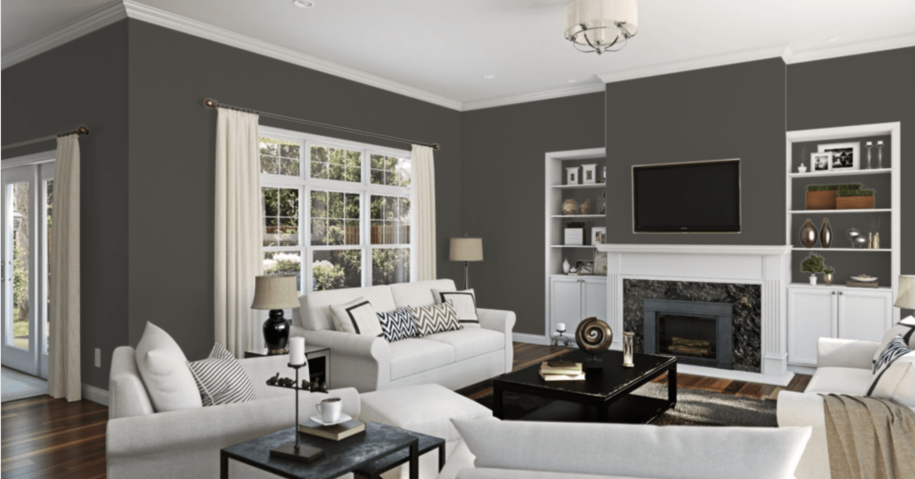
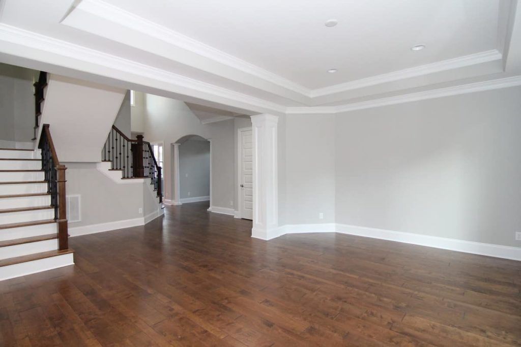
Mystical Shade
The beauty of this effortless look comes from inspiration that doesn’t belong to one style. Whether it’s mid-century modern lines, minimalist decor, or bohemian neutrals, this hybrid style is a blend of all three designs. Keep everything grounded and tied together with Mystical Shade’s versatile hue.
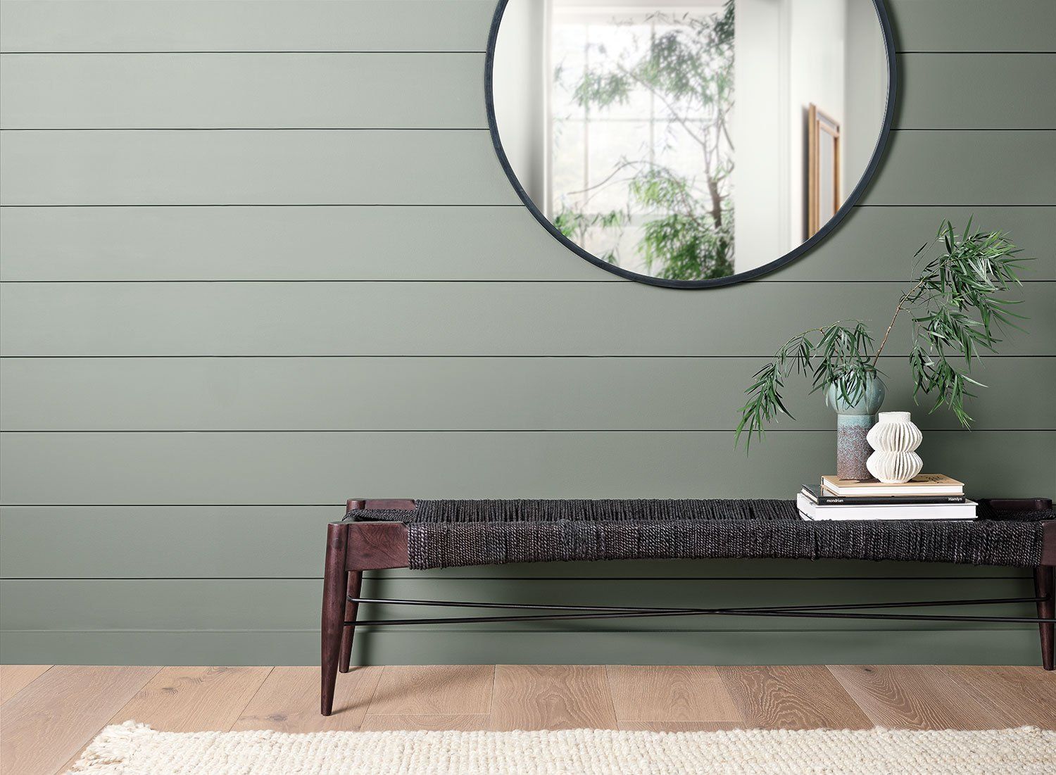
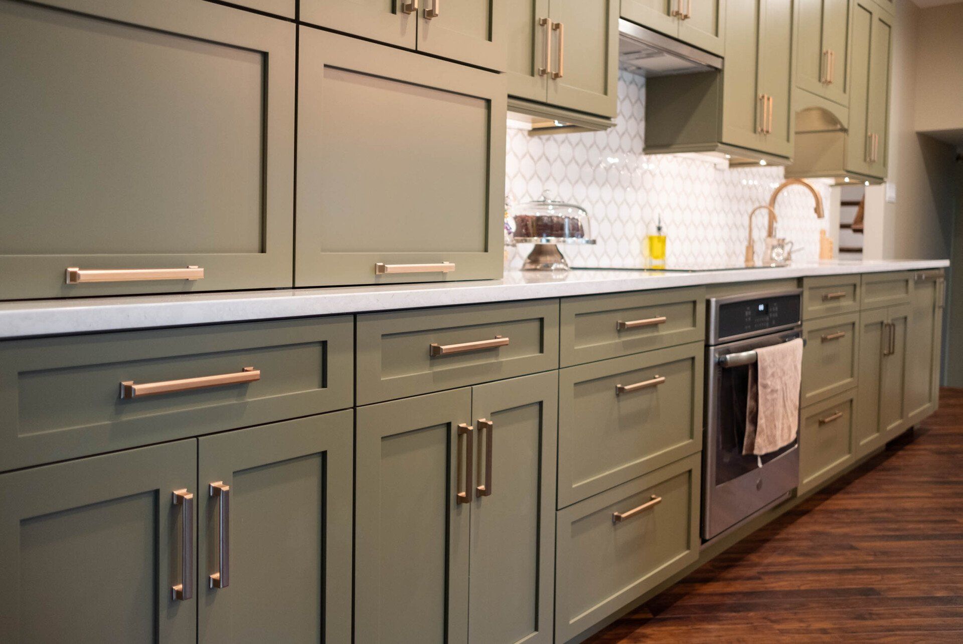
Pewter Green
Nature goes hand in hand with our well-being, so it’s no surprise we’re finding ways to bring it home. Pewter Green’s botanical hue carries a simple reminder to be present and enjoy the time you spend in your surroundings. It’s the calm before you start your day and the rejuvenation you need at the day’s end.
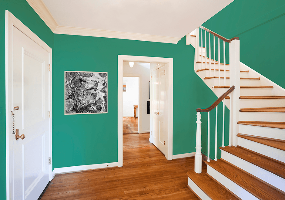
Alexandrite
Find joy in color! Alexandrite’s striking shade of green sets the tone for a carefree home where bright hues and bold patterns encourage nothing but good vibes. Dial up the brightness by adding vibrant blues and citrusy shades of pink and yellow to layer the look with a unique palette all about positivity.
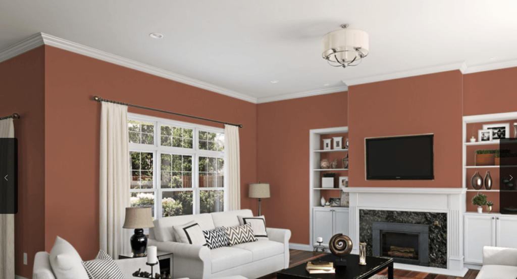
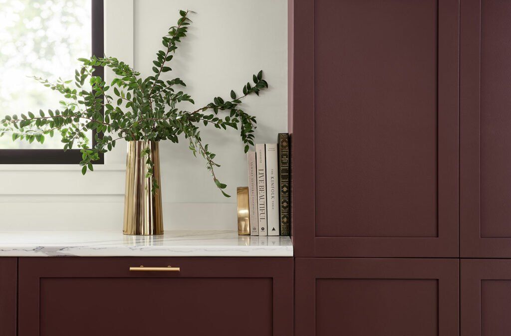
Carnerlian
Carnelian’s nostalgic hue is the perfect backdrop for heritage style to shine. Its rich color can instantly feel modernized when paired with bright metals making it easier than ever to blend the past with the present. You can also pair it with clean neutrals, thanks to a muted tone that plays well with soft hues.
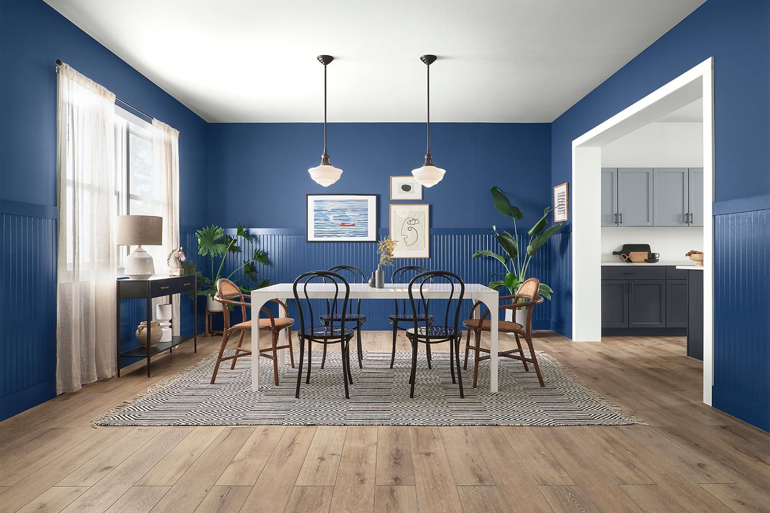
Commodore
Some of the most comforting spaces have a little bit of everything – that’s why a timeless blue like Commodore can tie it all together. No matter if your home is filled with a curated collection of artwork or a perfectly mismatched assortment of kitchenware, this universal hue gets along with any color or style.
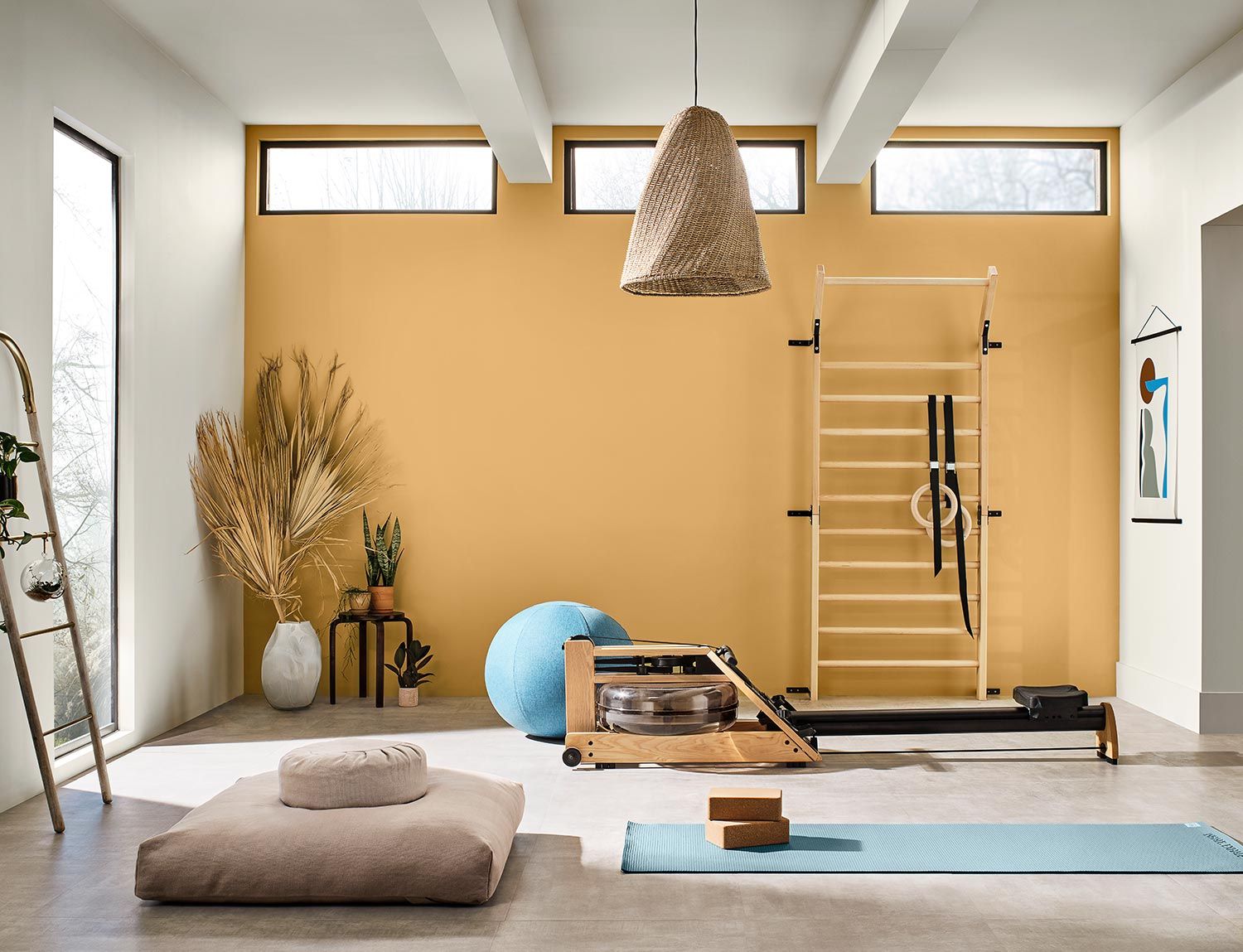
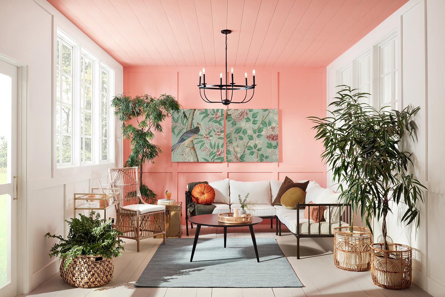
Jovial
From its carefree charm to its wanderlust lifestyle, a down-to-earth space creates the perfect place for taking in everything life has to offer. Whether that’s sunsets in the all-season room or morning snuggles with your little one, a poppy hue like Jovial begs you to bask in the positive and live in the moment – much like bohemians do.
Tell Us About Your Project And We Will Be Right With You
WEBSITE LEAD FORM
We will get back to you as soon as possible.
Please try again later.
I would like to receive updates about Reliable General Contracting's home improvement services and specials at the phone number provided. Note: Messaging frequency may vary and data rates may apply. Reply Help for assistance or STOP to cancel.
Family Owned & Operating Since 1999
Proudly Serving Royersford, Limerick, Pottstown, Collegeville, Phoenixville & The Surrounding Areas
Lic#PA119000
CONTACT US TODAY TO SCHEDULE YOUR ESTIMATE
All Rights Reserved | Reliable General Contracting | Privacy Policy
